All-In-One Wallet Connector(CCC)
Common Chains Connector (CCC) is a new wallet connectivity library developed in Typescript Lang, designed to make it easier for developers to help users connect with multiple ecosystem wallets and manage their assets directly on CKB.
What sets CCC apart is its use of CKB’s advanced cryptographic technologies coupled with native account abstraction. This feature fundamentally transforms how users transact and manage their digital assets across different wallets, providing a unified and fluid experience.
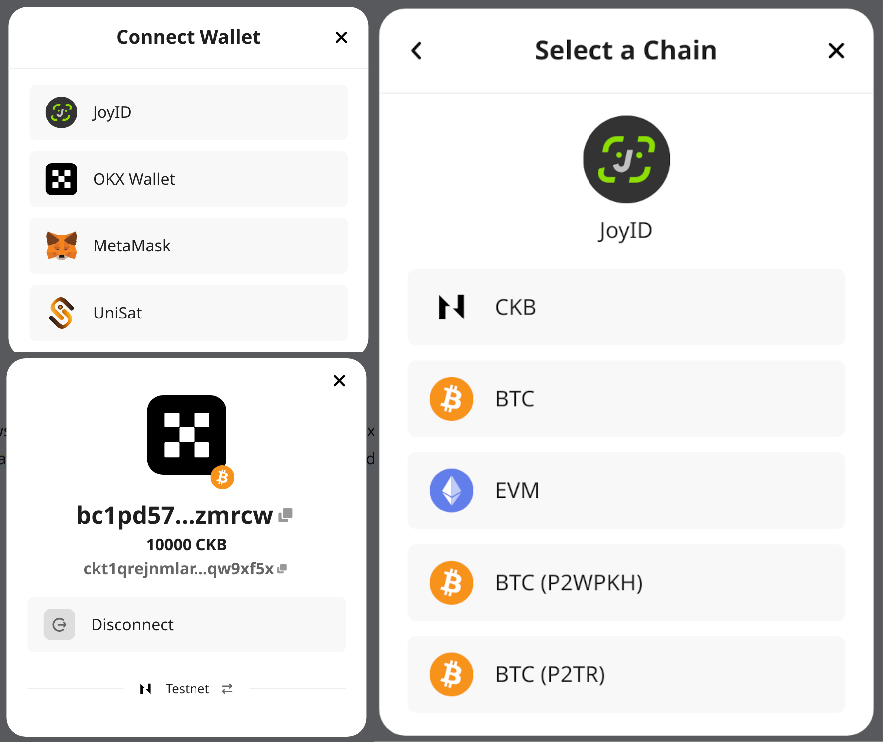
Currently supporting wallets like:
- JoyID
- OKX Wallet
- UniSat Wallet
- MetaMask
- UTXO Global
- Rei Wallet
- Popular mobile wallets (via EVM address): imToken, SafePal, and other Ethereum-compatible wallets
Installing
We design CCC for both front-end and back-end developers. You need only one package to fulfil all your needs:
- NodeJS:
npm install @ckb-ccc/ccc - Web Component:
npm install @ckb-ccc/connector - React:
npm install @ckb-ccc/connector-react
CCC exports everything on the ccc object:
import { ccc } from "@ckb-ccc/<package-name>";
Lumos Patches
For developers who use Lumos to compose CKB transactions, CCC provides patches to:
- Support the JoyID Wallet.
See lumos-patches: npm install @ckb-ccc/lumos-patches
You can apply patches by:
import { generateDefaultScriptInfos } from "@ckb-ccc/lumos-patches";

// Before using Lumos. You don't need @ckb-lumos/joyid anymore.
registerCustomLockScriptInfos(generateDefaultScriptInfos());
Quick Start with create-ccc-app
The fastest way to get started with CCC is to use create-ccc-app. This CLI tool helps you quickly create a new CCC-enabled dApp with built-in wallet connection support.
Creating a New Project
You can create a new project using any of the following methods:
yarn create ccc-app
# or
pnpm create ccc-app
# or
bunx create-ccc-app
# or
npx create-ccc-app@latest
The CLI will guide you through the setup process, allowing you to choose:
- Project name
- Framework template (Next.js, React or NestJs)
- Use TypeScript or JavaScript
Project Structure
After creation, your project will have the following structure (for example, my-ckb-app is a React project):
my-ckb-app/
├── src/
│   ├── components/
│   │   └── WalletConnector.tsx    # Pre-configured CCC wallet connector
│   ├── styles/
│   ├── utils/
│   │   └── stringUtils.ts         # Utility functions for string operations
│   ├── App.tsx                    # Main app component
│   ├── index.tsx                  # Main entry point
│   ├── layoutProvider.tsx         # Layout provider
├── package.json
├── README.md
└── tsconfig.json
Running the Project
- Navigate to your project directory:
cd my-ckb-app
- Install dependencies:
pnpm install
- Start the development server:
pnpm run dev
Your new CCC-enabled dApp will be running at http://localhost:3000
Using the Wallet Connector
The project comes with a pre-configured wallet connector as following:
Toggle to view the ConnectWallet component
/* eslint-disable*/
import React, { useEffect, useState } from "react";
import { ccc } from "@ckb-ccc/connector-react";
import { truncateAddress } from "../utils/stringUtils";

const ConnectWallet: React.FC = () => {
const { open, wallet } = ccc.useCcc();
const [balance, setBalance] = useState<string>("");
const [address, setAddress] = useState<string>("");
const signer = ccc.useSigner();

    useEffect(() => {
        if (!signer) {
            return;
          }

          (async () => {
            const addr = await signer.getRecommendedAddress();
            setAddress(addr);
          })();

          (async () => {
            const capacity = await signer.getBalance();
            setBalance(ccc.fixedPointToString(capacity));
          })();

        return () => {

        };
    }, [signer]);

    const renderConnectWalletBtn = () => {
        return <div className="cursor-pointer rounded-full border border-solid border-transparent transition-colors flex items-center justify-center bg-foreground text-background gap-2 hover:bg-[#383838] dark:hover:bg-[#ccc] text-sm sm:text-base font-bold h-10 sm:h-12 px-4 sm:px-5"
            onClick={open} >
            Connect Wallet
        </div>
    }

    const renderConnectedWalletInfo = () => {
        return <div className="cursor-pointer rounded-full border border-solid border-transparent transition-colors flex items-center justify-center bg-foreground text-background gap-2 hover:bg-[#383838] dark:hover:bg-[#ccc] text-sm sm:text-base h-10 sm:h-12 px-4 sm:px-5"
        onClick={open} >
            <div className="rounded-full mr-2">
          {wallet && <img src={wallet.icon} alt="avatar" className="w-6 h-6" />}
        </div>
        <div>
          <h2 className="text-sm font-semibold">
            {balance} CKB
          </h2>
          <p className="text-xs flex items-center gap-2">
            {truncateAddress(address, 10, 6)}
          </p>
        </div>
    </div>
    }

    return (
        <div className="flex">
            {wallet ? renderConnectedWalletInfo() : renderConnectWalletBtn()}
        </div>
    );

};

export default ConnectWallet;
Here's how to use it:
import React from "react";
import ConnectWallet from "@/src/components/ConnectWallet";

function App() {
  return <ConnectWallet />;
}
Customizing the Wallet Connection
You can customize which wallets to support by modifying the connector configuration. Here's an example:
import React from "react";
import { ccc } from "@ckb-ccc/connector-react";
import { CSSProperties } from "react";

export function LayoutProvider({ children }: { children: React.ReactNode }) {
  const defaultClient = React.useMemo(() => {
    return process.env.REACT_APP_IS_MAINNET === "true"
      ? new ccc.ClientPublicMainnet()
      : new ccc.ClientPublicTestnet();
  }, []);

  return (
    <ccc.Provider
      connectorProps={{
        style: {
          "--background": "#232323",
          "--divider": "rgba(255, 255, 255, 0.1)",
          "--btn-primary": "#2D2F2F",
          "--btn-primary-hover": "#515151",
          "--btn-secondary": "#2D2F2F",
          "--btn-secondary-hover": "#515151",
          "--icon-primary": "#FFFFFF",
          "--icon-secondary": "rgba(255, 255, 255, 0.6)",
          color: "#ffffff",
          "--tip-color": "#666",
        } as CSSProperties,
      }}
      defaultClient={defaultClient}
      clientOptions={[
        {
          name: "CKB Testnet",
          client: new ccc.ClientPublicTestnet(),
        },
        {
          name: "CKB Mainnet",
          client: new ccc.ClientPublicMainnet(),
        },
      ]}
    >
      {children}
    </ccc.Provider>
  );
}
Examples
CCC demo
- online preview: https://app.ckbccc.com/
- source code: https://github.com/ckb-devrel/ccc/tree/master/packages/demo
NervosDAO
- online preview: https://www.nervdao.com/
- source code: https://github.com/ckb-devrel/nervdao